Stretching the Truth
by Adam Rubin
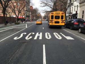
The other day I was walking through New York City when I noticed these skinny letters in the street.

Turns out nearly all the words painted on public roadways in America are skewed in a similar fashion. That’s because the type is designed to be read at an extreme angle by motorists whizzing by at 30 mph or more. To a pedestrian, the words look stretched out like rubber bands but to anyone driving by in a car, they seem perfectly legible.
This is an example of “anamorphic typography”. Anamorphic comes from Latin and means “reshape”. In the case of the writing on the road, the letterforms are reshaped to make them easier for motorists to read. Maybe it’s just me, but this is pretty neat. It’s not every day you come across a government-funded optical illusion. My favorite use of this technique was created by Axel Peemoeller back in 2006. He designed an anamorphic wayfinding system for the Eureka Tower Carpark in Melbourne Australia. Unlike the High Occupancy Vehicle (HOV) diamonds painted on a highway, parking garage directions need to work in three dimensions.
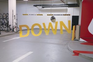
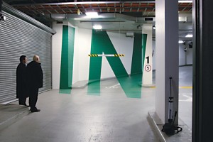
The words painted throughout the garage are only legible to drivers approaching from locations relevant to the information. Just like the “School” example, the letters look totally distorted to anyone walking by because they are designed as perspective-specific communications.
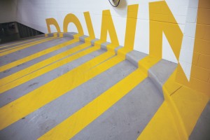
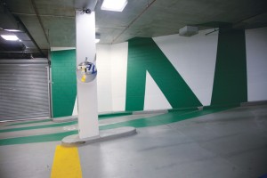
The inspiration and technique for this particular design came from celebrated French artist Felice Varini. Varini is famous for utilizing projectors to paint 2-dimensional images across 3-dimensional spaces.

Photo: André Morin
There are loads of great examples of anamorphic imagery but we’ll save those for another time.…Today, we’re focused on words. Creating your own messages with anamorphic type is fun and you don’t have to run out into the street to experiment. Here’s something you can try at home without getting run over:

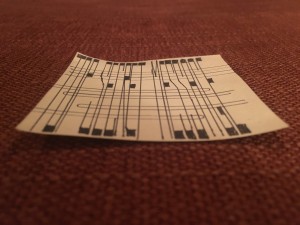
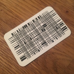
Take a look at the above image. Kind of looks like a bar code or something right? Well, at a very extreme angle, a secret message is revealed. In this case, the top secret message is “Top Secret Message”.
You can create your own secret messages. All you need is the code below and a slotted spatula.
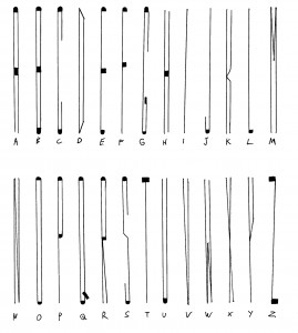
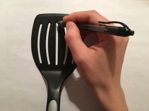
Using the long skinny slats of the spatula as a stencil, it’s easy to draw any letter of the alphabet anamorphically. Take a look at the letterforms carefully and you’ll notice some patterns. Each character is created using as many 90-degree angles as possible (like the numbers on an LED clock). To draw vertical lines, trace the edge of the stencil with your pencil. For horizontal lines, make a tiny box and fill it in. Diagonal lines need to be a little thicker than the vertical ones to read properly (you can angle the spatula to help keep the diagonals straight as well). Once you’ve got the hang of it, you can create messages invisible to the casual observer, even multiple messages overlapping each other at 90 degrees to further obfuscate your intentions.
For me, there is great potential in designing communications to be read only by viewers at specific vantage points. What might you write for someone looking down into a box of crackers or lying down on the floor? Send me your ideas (rubin@conjuringarts.org) and I’ll include them in my next post. Until then, have fun out there!
Adam Rubin is an author/inventor based in New York City. His latest book, Robo-Sauce (a New York Times Best-Seller), has received critical acclaim for its innovative use of paper-engineering: the book transforms into a robot in the hands of the reader. To learn more, visit www.whothehell.com.

 Your Email Address is Safe With Conjuring Arts